- June 20, 2022
- Posted by: Shane Daly
- Category: Trading Article

In a recent article, I wrote about finding support and resistance levels inside the extreme high and lows of price movement. There was interest in a trading approach that focused just on that type of setup so this post is about a price pattern called the “Quasimodo” (over/under pattern or OU for short). Despite the funny name, it is simply a change of trending price structure with a pullback to a defined area of support or resistance.
Trending Price Structure
When price is advancing in an uptrend, price tends to make higher swing highs and lows as buying continues to drive price higher.

Eventually, price will begin to form a trading range or roll over into a down trending structure of lower highs and lower lows. Believe it or not, understanding this simple concept can allow you to profit from trading. Check out My Top 2 Patterns For Bull Markets article to see how you can use this evolution of price to trade.
The Quasimodo pattern will use this evolution as the basis for the setup and a reversal trade.
Not Head And Shoulders Pattern
While the OU pattern resembles the head and shoulders chart pattern, there is one glaring difference in one of the levels.

Notice the second swing lows marked as #1. The head and shoulders has the support levels (resistance levels in a down trend) roughly equal while the Quasimodo has the second low lower than the first. In fact, the further the second low breaks to the downside, the better.
The area of interest is also different where the neckline, the area between the two higher lows on the H&S pattern, is where you want to see price break. With the Quasimodo, we want to see an opportunity up at the right shoulder.
How Does The Quasimodo Work?
For the most part, we are looking at the same dynamics as the H&S pattern until we get to the second low. When the H&S doesn’t take out the first low (or does by a small margin), buyers are still content and stops may not have been taken out. In fact, some traders may consider it to be a double bottom formation which is bullish.
With the OU pattern, we are starting to see a lower low in place and a trend change is almost confirmed. Stops may have been taken out and when price reverses to put in the right shoulder, buyers may be breathing a sigh of relief. Some buyers may be under water (someone had to buy the highs), and when price starts coming back upside, they may look to exit at the first sign of a price pause.
Once price begins to fall again, those holding longs sell out and with fresh sellers, we get further downside (considering we were originally in an uptrend).
Quasimodo Examples
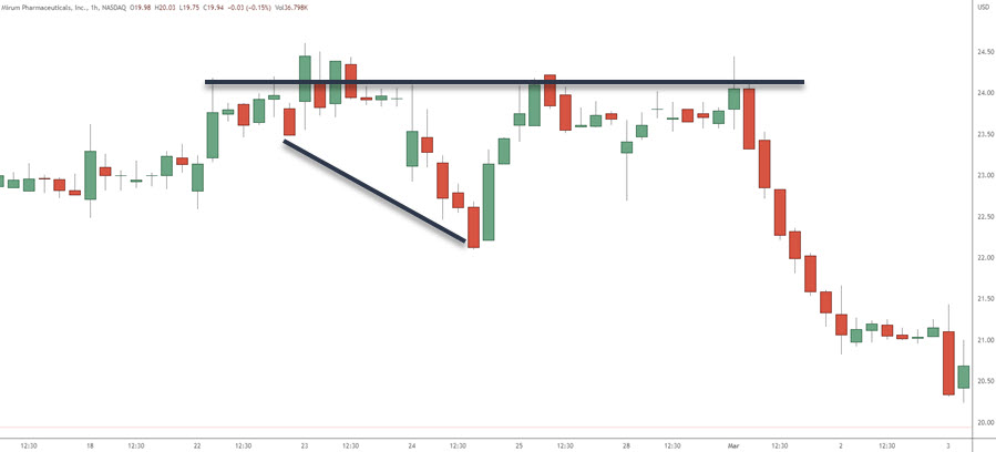
Like all price patterns, you won’t always find perfect examples of them. Also consider that a 60 minute chart is made up of twelve five minute candles. A pattern you will see on a 5 minute chart may look completely different on the hourly. A pattern on the hourly may look really choppy on the five minute.

You can see the left shoulder, the head, and then an extremely lower low. Price rallies back up into the zone at the first shoulder.
Let’s look at Bitcoin against the USD where we get two cracks at selling at #3.

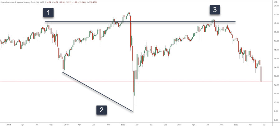
You can find these on a higher time frame as well. This is a daily chart of a stock.

We have the left shoulder at 1, a retrace and a rally forms the head. Our decline takes out the first lower low and you can see how steep the drop is at #2. Rally to number 3 and we have our short trade.
How To Trade The Quasimodo
We need to see the first part of the setup which is the left shoulder, a low, the head, a lower low, and we wait until we get the right shoulder.
This is a one hour stock chart of Blink and we are waiting for the formation of the right shoulder.

Once price gets to the black line, you would need an entry trigger which could be anything from a candlestick pattern to a resting order to sell. If using a resting order, you want to make sure your stop loss goes above the head (the highest red line). If using a candlestick pattern, you’d look to place it just above that pattern (lower red line).
Profit target is usually the low before the right shoulder forms.
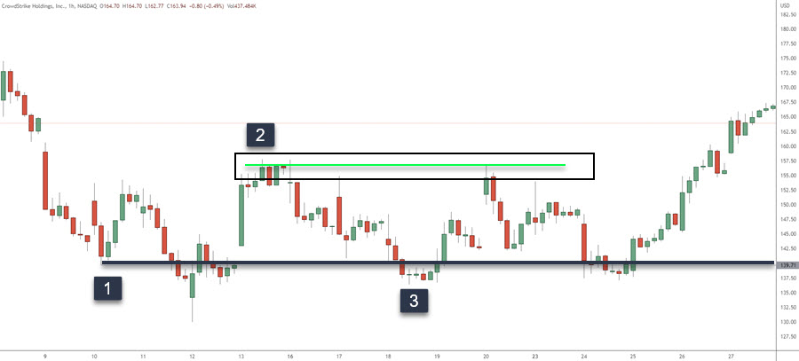
One more example on the buy side.

Number 2 gives us our higher high and our profit target. Price returns to the same zone as number one where number three is labeled. Price does rally to the zone at two, retraces for another bounce and continues higher.
Conclusion
A fairly simple but powerful price pattern that will show up on any time frame and in any market.
Don’t look for the perfect formation but understand how it forms. Ensure you decide on a trade entry trigger as well as where you place your stop loss. While the profit target is obvious, using a trailing stop on part of the position may be a good plan for traders looking for bigger moves.
