- February 7, 2016
- Posted by: Shane Daly
- Categories: Advanced Trading Strategies, Currency Trading, Futures Trading, Trading Article

Nothing exists as the only way to trade.
There is no one singular trading edge.
There is however one trading habit that all traders that wish for success must follow and that is to consistently apply your edge every time you face your charts.
For many traders that I know, including myself, part of that edge is having a confluence of factors lining up for each and every trade. Inside of each variable of that confluence is consistent application of that variable.
Trading Consistency With Approach
To better understand what that means for your trading habits, consider that you use zones of potential support and resistance in your trading. You would have a fundamental way you locate these zones and it does not vary each time you use them.
Let’s take that further, imagine that you don’t use the standard method of locating extreme turning points as your first approach. You take more interest inside of the extremes.
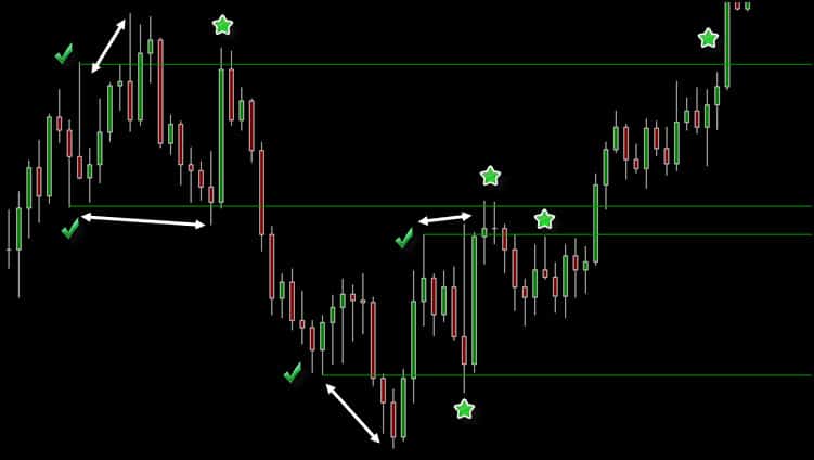
The green check marks on this chart indicate where you deem the true areas of support and resistance reside in this immediate location on the chart. While many traders stick with the conventional extremes, you go inside the left of the extremes and project to the right.
The white arrows indicate where you look for a lower low (higher high) and then look to the immediate left for the low/high that came prior. That begins your zone of interest.
The stars indicate where price meets zone and this is where you take interest in seeing there is potential on the chart. You don’t consider, ever, changing your approach “this one time” to “fit” what the chart is printing.
You repeat it over and over again.
That is being consistent. As a side note, inside of the extremes is where I personally find use for horizontal and diagonal lines to indicate S/R even on a longer term basis. I first heard about this method through Jack Schwager who wrote about it in 1999.
For reference, after price broke the highest line and rallied, it returned to the exact same price point two months later.
Time refines your trading.
Inside of this trading blog, I have covered many ways that I look at what the chart is presenting. Things refine as your experience grows of course but regular readers will notice that the basics remain the same.
There is no jumping around in extreme changes with the trading approach nor in the usage of technical factors or indicators. Consistency is vital but always with an escape hatch for refinement to allow for a simpler process without having a negative influence on the edge.
I covered trading in the Euro Futures contract a short while ago and to show consistency especially in the form of confluence, I am once again going to cover this contract.
Back From Illness
I got hit with what appears to have been the flu and was sidelined for a while from trading. On the night of Feb 3, I sat down to look at the daily charts of the Forex market.
This is my favorite market to swing trade/position and with USDCAD positions on and headlines of a weakening greenback and stronger oil prices (short lived), I wanted to see the structure of the chart.
I then brought up the EURUSD chart and saw the following.
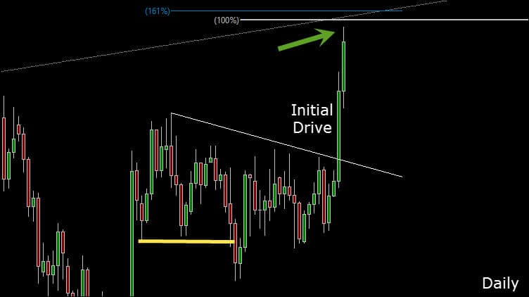
The previous Euro post was after price had broken the double bottom and then was bought back up into the range which offered long trading opportunity. The Euro stayed inside of a channel (condensing) and I have written before that condensing ranges will most likely have sharp breakouts when they come.
Related – Range Trading – A Simple Strategy
The general rule is not to fade the initial drive.
Price drove to the upside and given the opportunity that may be present due to this drive, I chose to be in place for Feb 4 and after the unemployment claims number.
Prior to the 8:30 number release, price had already put in about a 150 pip drive. The release carried it further and we topped out around 20 pips higher.
From a technical point of view, we have a confluence of variables that have lined up that pointed to potential shorting opportunities.
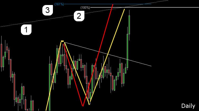
1. Internal demand line that was in place from Sept 2015 and then broken. Extended to present day.
2. 100% projection of the prior drive in price as shown in yellow.
3. 161% extension of the prior swing in price as shown in red.
These are standard tools that I’ve shown in the past and are shown here in a consistent manner from prior trading tips.
Day Trading Edge
As the news release played out, we found ourselves banging on the potential of at least some slight retracement in price.
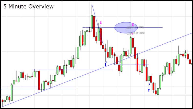
While the setups and targets occurred on the five minute chart, for better detail I will use the two minute chart.
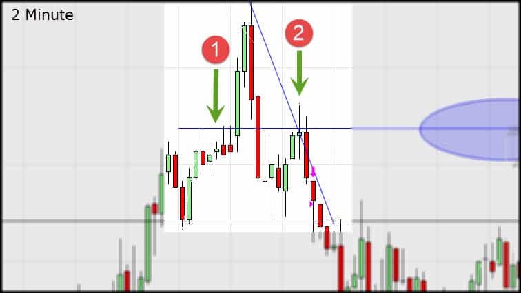
Another side note about finding levels inside the extremes: the line marked with the blue star not only added confluence for two shorts, but also capped price four hours after the last test shown here.
The upside drive in price has strong volume numbers and as expected, all those long were eaten up when price immediately turns and wipes out all of their gains.
Once I see a sharp move like this in price, trading the next pullback, in this context, can be a high probability play.
Longs are about to regret jumping on extended moves.
Price rallies to the area marked by the green arrows which anchors at #1 as resistance, broken to the upside, back to the downside and then again shows a resistance at the same price zone at #2. It has also retraced 50% of the prior collapse.
Related – How Fibonacci Levels Can Help Your Trading Results
A short trade is initiated on the 5 minute chart.
The price target is a 100% projection of the first swing down in price. That also coincided with a zone that contains the 1.2000 level, an internal demand line, a 200% extension of the swing up into the shorting zone and an area that resisted price in the recent past.
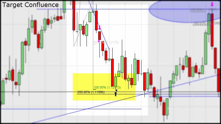
You can see price slam into the profit area and quickly retrace. Refer back to the 5 minute chart to see what I was seeing at this time. Price continued slightly lower than the demand line and started the retrace off the top of a prior range.
It’s very easy to get caught up in the smaller time frame but keep in mind that the 5 minute was the trading chart and the lower was simply used for finer detail of the zones seen on the 5 minute. I am still expecting a “bigger picture” pullback and was mapping out a confluence zone during the pullback.
Consistency Plays Out Again
Showing the 2 minute chart again, price has pulled up into our zone of opportunity.
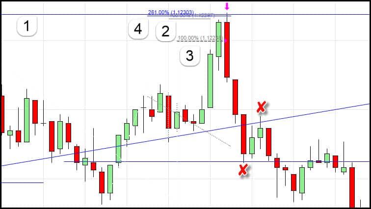
1. This is the same resistance line we used in the first trade.
2. This is the first swing up in this swing projected upwards showing us an A-B=C-D.
3. This is a 100% measure of the final thrust into the high that came just prior to the start of our down move after the news.
4. This is the 261.8% extension of the retrace that came after the first leg of this move.
Price action behavior is what triggers this trade as the two thrusting green candles are unable to continue the move and once the rollover of approximately 50% of the final green candle occurred, a market order short was undertaken.
It’s not always clear sailing
We run into an issue at the first red X.
The retracement of 78.6% of the low to high of the swing is a line in the sand area. If price does not break this level, we often see a retracement in price that can erase current gains. If those break however, we can be more confident in our profit target below the low being hit.
To add this, I also have a blue line marking off an area of potential support that may not be obvious. Keeping in mind the internal levels that are used, refer back to the 5 minute chart and why this level is here should be obvious. Hint: look for a long lower shadow that comes prior to the extreme low.
What keeps me confident in the trade is the backward bounce off the broken demand line at the second red X that we’ve had in play all session.
Consistent Profit Targets
There are many ways to take profits including trailing and fixed targets. Which ones you employ may depend on the context you find yourself in but like anything in trading, consistency is key.
Related – Trading Profits and How To Take Them
The profit targets for the second short are found in the same consistent manner as the previous ones. Total combined for both trades = 61 pips.
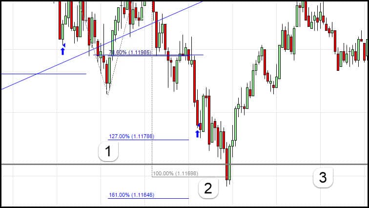
1. This is the 127% extension of the swing into the shorting zone. What you can’t see on this chart but can on the 5 minute chart is a blue line on the left of the chart.
It is drawn in the same manner as described earlier giving us a resistance zone turned into a support zone and confluence at this level.
2. Another A-B=C-D 100% measurement from the previous larger leg of this down move.
3. This is the 100% symmetry project from the high of the previous day to the low prior to this high. It is a measurement of a previous pullback which can be considered a “normal” pullback in the current market environment.
I find symmetry very important in my own trading so for clarity on #3, I deleted everything from the chart and left this measurement (marked with X) as well as the internal S/R lines so you can see how relevant they are.
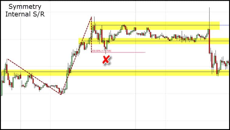
The yellow highlights the internal levels and you can see they acted as both S/R.
Find Your Trading Edge
I want to wrap this up with one more example of consistency and using measured moves for profit targets. These are not “one-offs” and appear over and over again. They’ve been covered in many of my writings, trade examples and measured moves played a large part in this trading example.
Staying with our 15 minute chart for the bigger view, let’s see how the spike out of the range and the eventual collapse terminate at measured moves that occur often enough to form part of a developed trading edge.
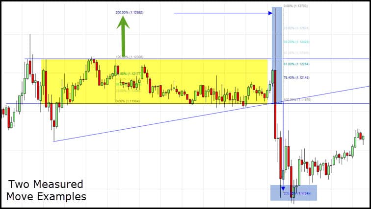
The yellow highlights our trading range found within our internal S/R lines that have had multiple hits. The price spike on the upside is 200% of the width of the range. This is a common measurement.
The blue highlights a demand line break measurement. We take the high inside of the demand line which is the spike high and anchor it to the breakout point. You can see that price again terminates in the zone of 200%
This may seem like a lot to digest and it is. It’s one thing to understand what you are seeing and another to actually be able to implement in a consistent manner. It takes a lot of commitment to get a handle on trading in this fashion. That is one reason that many traders seek a more mechanical way to approach their trading.
Netpicks has been producing effective trading systems since 1996 and as a thank you for reading, please download the free version of Trend Jumper – our most effective trading system to date!
