- April 15, 2020
- Posted by: NetPicks
- Category: Trading Article

Kagi charts were developed in the 1870’s in Japan, and many of us in the US first learned about them from Steve Nison in his book Beyond Candlesticks.
When we started using Range and Renko Charts with our systems here at NetPicks a while back, we got a lot of questions about different charting techniques like Renko charts that traders can use.
One chart type we were asked about were Kagi charts since traders thought the idea of using charts that are not dependent on time, would be interesting.
They liked the idea of filtering out the noise of the markets and that could give them a better indication of the price trend.
For traders who use the standard candlestick chart for stock charting, futures, Forex or whichever market is traded, it opened up new opportunities and trading strategies as the price fluctuations that can happen in choppy markets, are no longer an issue.
Kagi Charts 101
Looking at a Kagi charts you might think you’re seeing a very long snake gradually weaving its way to the right. There appear to be no distinct price bars as you’d see in time-based, Renko or other charts, but that’s simply due to the presentation method.
We do in fact have a series of price bars, the vertical bars, connected by the short horizontal bars.

Every horizontal bar represents a high or a low. A bar that moves from a low to a high is an up bar, one that moves from a high to a low, a down bar.
Note also that an up bar can be either thick (green on some platforms) or thin (red on some platforms), so color or line thickness does not reflect the direction of price movement inside the bar.
The style or color of the Kagi line tells us what the dominant market trend is.
- A green line tells us the market is in a rally and the dominant trend is up.
- A red lines says that the market is in decline and the dominant trend is down.
Each of the elements of a Kagi chart also has a unique name.
- The thick line is called the yang line
- The thin line is called a yin line
- High is referred to as a shoulder and appears at the top of the vertical lines
- Low is referred to as a waist and appears at the low of a vertical line
Kagi Chart Price Reversals
You notice that the lines change color and when that happens, we determine a trend reversal has taken place.
Consider an up bar, one that started drawing from a price low. As long as price continues moving up, the bar grows longer and the high of the bar extends further.
Minor price fluctuations will not affect the direction of the bar. However, once price retraces a predetermined amount dictated by the reversal amount, your charting platform will draw a short horizontal line at the bar high and commence drawing a down bar.
As long as price continues to move down, the new bar will extend lower. If price however moves back up by the same predetermined amount, we establish a new low, draw a horizontal line at that low and begin drawing an up bar.
Traders have to set up the reversal amount inside of their charting platforms. There are several ways to do this and it will depend on the software you use for charting Kagi.
- Use a fixed dollar amount
- Percentage of price
- Average True Range (ATR)
The reversal amount is important especially for day traders because if they set the reversal amount too high, they will miss out on many trades as they wait for a change in the trend direction.
Time frame will also matter as the closing price of a 15 minute chart will show you more information than waiting for the daily chart closing price.
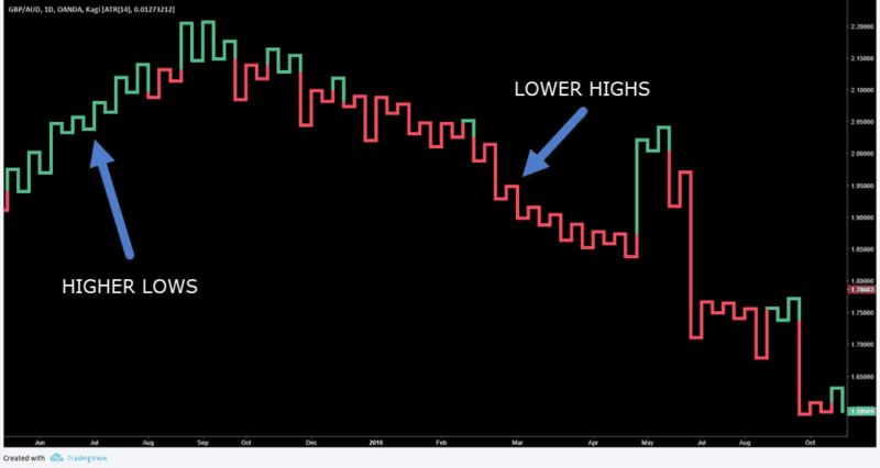
This Kagi chart uses a 14 period Average True Range setting to determine the price movements that must happen before we get a signal in the other direction. You are welcome to use other atr values which will represent volatility during a larger or small time horizon and that may suit day traders.
Note that you can have a series of reversal but the line style – thick or thin – will not necessarily change. In effect what you’ll see is essentially a series of swing highs and swing longs.
In order for the vertical lines to change color after a shoulder or waist appears, we would need a line break of the previous high or low.
Dominant Trend Reversals
As stated earlier, a thick line indicates a dominant trend to the upside. As long as price does not move below the previous low on the Kagi chart, that dominant trend will remain in effect and the line will remain thick.
- Once the previous low is broken, the style immediately changes to a thin line, indicating that the dominant trend is changing to a downtrend.
- Conversely, when a thin line has price breaking a previous high, it becomes thick again indicating a shift out of the dominant downtrend.
I have marked several of the main trend changes on this Kagi chart of crude oil futures.

In your trading strategy, you’d need to see a couple of reversals where the line remains thin before accepting that the dominant trend has changed, since as you know prices usually go through a consolidation period before definitively changing direction.
These consolidations show up clearly on a Kagi bar as a succession of short thick and thin lines.
Trading With Kagi Charts
The traditional approach to trading Kagi charts says that you buy whenever the line changes from thin to thick, and you sell when it changes from thick to thin. Because the Kagi charts filter out a lot of the market noise, this can keep you in some very nice trends.
Of course it’s not perfect either, as you’ll still be susceptible to chop whenever price consolidates just as you would with candlestick charts.
You can also use Kagi charts as a directional filter for your current trading system. Open a chart with your trading system and a separate Kagi chart for the same instrument.
Only take long setups from your system while the Kagi line is thick, and only take short setups from your trading system while the Kagi chart is thin.
Finally, you can use all of the usual technical analysis techniques with Kagi charts, including support/resistance levels, price formations, and all of the technical indicators available in your charting package.
Give it a try: pull up a chart of your favorite trading system and simply change the chart type to Kagi.

This Kagi chart shows the standard trend lines, trend channels, and seeing a trend line break with a Kagi reversal sell signal.
Give Kagi Charting Technique A Try
Kagi charts are another tool we can use in trading the markets. They do a great job of filtering out noise and indicating major trends and can be used either on their own or in conjunction with other charts and trading systems.
The key is to understand the reversal amount (price change) and while picking a price can be subjective, I’ve always preferred to use a volatility measure such as the ATR value. This will ensure that any buy signal or sell signal that comes with the trend change, is tuned to the market movement.
Open up Kagi charts of your favorite instruments, experiment with the reversal size and see how you can incorporate them into your own trading. The main strength of a Kagi chart, filtering out the noise, may help increase your trading success.
Kase charts are another type of charting that you may find interesting.