- October 6, 2015
- Posted by: CoachMike
- Categories: Options Trading, Stock Trading, Swing Trading, Trading Article

In trading it can seem like we are on a never ending quest to find the magic formula for consistent profits.
Once you are involved with the markets for a stretch, it can seem like you have heard and seen it all.
I reached this point about 5 years ago after reaching a rough stretch in my trading.
What I realized was my system was designed for a specific market type, when in reality the market was constantly changing.
Trading Evolution
As markets continued to make large swings back and forth in quicker cycles, I found was my system was slow to react. At the time I was using a system focused on time based charts.
In my case, I was looking primarily at the 195 minute chart (meaning each bar or candle represented 195 minutes of price action).
I used this time frame because I wanted more frequency than a daily chart. Speeding the time frame up did help some but I still found in many cases I was late to the action.
It was around this time that NetPicks started doing more with range based charts. Instead of charts printing bars or candles on a set amount of time like I was used to, the range based charts focused purely on price action.
For example, if I am using a range chart of 1.00 on AAPL that means the chart will print a candle each time AAPL moves $1 from high to low. This has nothing to do with time at all.
AAPL could move $1 in 5 minutes or 2 days depending on how active the market is. By using this approach the charts gave me faster setups, which allowed me to catch more of the quick moves.
I started using this chart type as the main driver of the Active Swing Trader system that we use as part of the NetPicks Options Mastery program. You can see the Active Swing Trader in action for yourself by clicking on the link below.
All Stocks Are Not Created Equal
As great as range based charts are, there were some issues that I had to work around.
An $8 stock like CHK is completely different than a $550 stock like AMZN. As a result, we have to use different range settings for each product. A $1 move on CHK is a very large move that could take days or weeks to play out. The same $1 move on AMZN could come in 5 minutes.
The remedy to this situation is to use a calculation (or an indicator) that tells you what the average range is on that stock.
A basic indicator that can be used is the Average True Range indicator. This is a pretty standard indicator in most charting platforms and does what the name implies. It tells you what the average range is for a stock over a set amount of time.
For example, you might find that the average daily range on AAPL is $.75 instead of $1. This will allow you to make adjustments to the different products on your watch list.
Our formula for calculating specific range settings allows us to get very specific for each name that we trade.
We use a range setting of 115 for AAPL while at the same time use a range setting of 70 for AAL. This indicates that our AAPL chart will print a candle every time AAPL moves $1.15 from high to low.
That could mean we get 3 candles in a day if the market is active, while only one candle a day in a slow market.
This allows us to react to the changing market conditions.
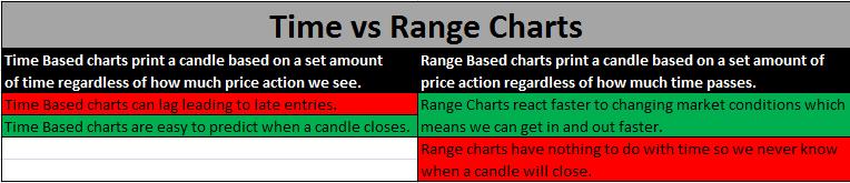
You can see the difference in how range based charts handle price action when compared to time based charts in the images below. The range charts clearly react faster to changes in price.


Monthly Trading Review
We look at our formula for each product on our list once a month. This allows our system to self adjust to changing conditions.
If the market volatility really picks up, then our range settings will expand allowing us to adjust on the fly.
If markets slow down, then we will do the opposite. Our system will have us looking at lower range settings.
The formula that we use is done in just a few minutes once a month and can make a huge difference in our bottom line results. You can see the difference in the range settings in the charts below.
The first chart shows the range settings that we were using during the month of August.
The second chart shows the range settings that we were using during the month of September.
You can see how as market conditions change we changed the range settings along with it. This allows us to stay fine tuned with current conditions.


Range Charts Have Faster Reactions
When going back to compare my results using a time based chart vs. a range based chart I noticed a few things.
First, while the time based chart often got in late, the range bar indicator chart reacted much faster. As a result, I found that the overall growth in my equity curve started to get more consistent.
Now I’m not saying the range based charts will eliminate all losing trades. Losing trades are part of trading and will come with any system or approach. However, if I can improve my win rate with a simple change like moving from a time chart to a range chart then it’s an easy decision in my book.
Second, the range based charts allowed me to really focus in on current market conditions. While time based charts can work in certain environments, I found that they would also completely break down in other environments. I accepted the fact that markets will be constantly changing and the range charts allowed me to change along with the markets much faster.
Time based charts will get you in late to moves because they take so long to confirm.
I find that in today’s market environment, where we are seeing hundreds of points of Dow movement intraday, that the time based charts get you into trades too late in the move. The range based chart is focused solely on price action and might get 3 candles in the same amount of time that a time based chart has 1 candle.
This could mean I get in and out of a trade on a range chart before the time based chart even has a setup.
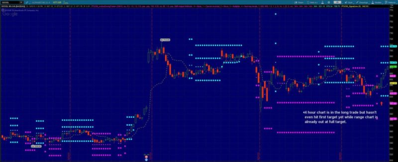
You can see a perfect example on the GOOGL charts below.
The range chart shown on the first image below actually hits full target before the trade on the time chart shown in the second image hits first target. This makes a huge difference in the overall P/L when trading GOOGL.

If this is the case why doesn’t everyone use range based charts?
For one, it’s not a chart type that is talked about or even taught very often. They also can take some getting used to because the candles can close at any point during the day.
If you are using an hourly chart then you know candles will close at the end of every hour. It’s very predictable to know exactly when you need to check the chart for a new setup. The range based chart is focused on price action so your chart could have candles closing at any time.
This means they take a little more attention to detail.
While there are pros and cons to a range chart, I have found that the increased profitability makes them well worth it. They aren’t the magic wand that will turn every trade into a winner.
However, if they allow us to react faster to the volatile markets that we are seeing these days, then it is something I want to have in my toolbox. The main reason I made the change in my own trading was due to the increased performance.
Any change that I make to my personal trade plans has to be backed by statistics. If I can’t do that then I can’t make the change.
So do some research and take a look at how powerful range charts can be. I can promise it will be worth your time. They have made a huge difference in my own trading as my equity curve continues to grow. The range charts could be the answer that you have been looking for to better handle the big movement in today’s markets.